Challenge
Firefighters make critical decisions with limited visibility, fragmented communication, and seconds to react.
Soteria
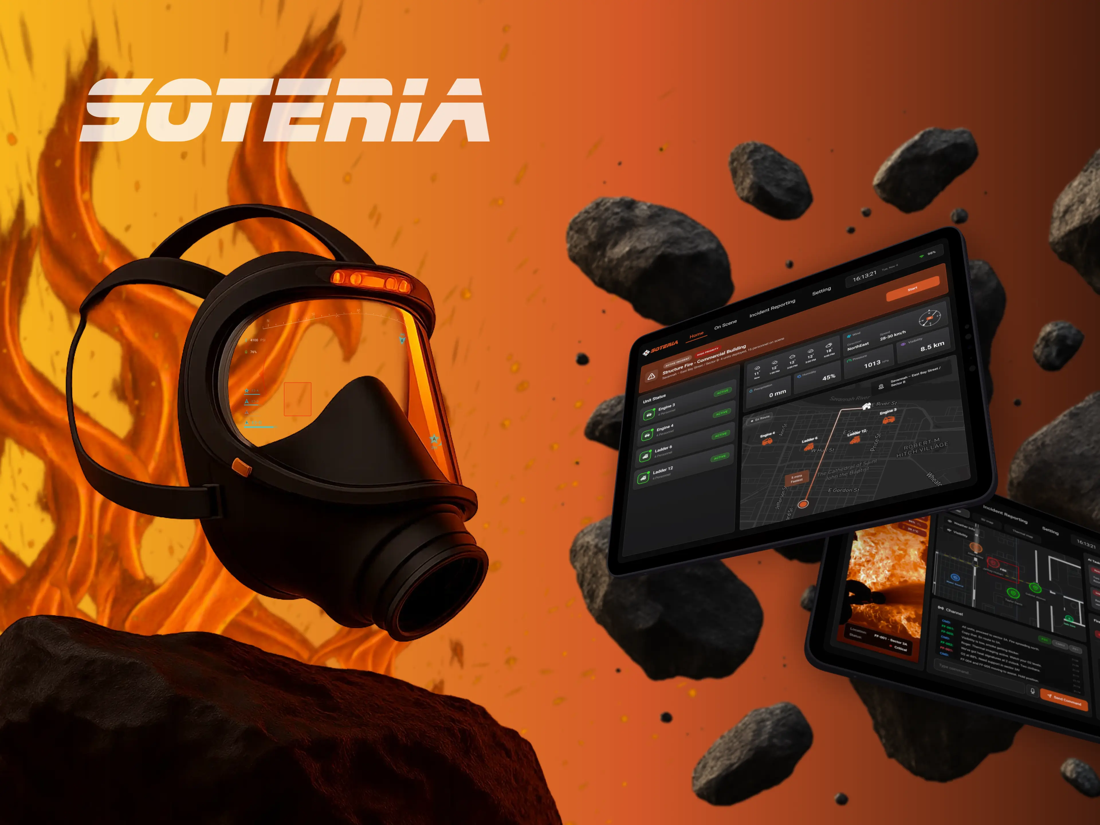
Soteria connects firefighters in the field with incident commanders through an AR interface and command tablet designed for high-pressure, low-visibility environments.
Red Dot Winner · 2026
Firefighters make critical decisions with limited visibility, fragmented communication, and seconds to react.
Connect the field and command into one shared information loop.
We designed two coordinated interfaces: a minimal AR view for firefighters and a command tablet for incident commanders.
A safety-critical UX system grounded in direct firefighter research.
Soteria translated 500+ raw research data points into a connected field-and-command experience designed to make critical information easier to recognize and act on.
The environment
Firefighters operate in environments where vision, hearing, movement, and decision-making can all degrade at once. The interface cannot assume a calm user, a quiet room, or time to search.
63K+Firefighters injured in 2023
Sight and sound were only symptoms.
In an emergency, more information is not automatically better. Firefighters need to recognize what matters without searching, interpreting, or breaking focus.
Field research
We met firefighters in Savannah to understand how information, communication, equipment, and command actually work under operational pressure.
500+Raw research data points
From insights to principles
01
02
03
System architecture
Soteria was designed as a feedback loop rather than two isolated products. Firefighters contribute live field context while commanders translate that shared picture into guidance, priorities, and support.
Shared awareness
Guidance returns to the firefighter
The wearable layer
The Soteria mask carries the firefighter-facing AR experience within protective equipment, keeping critical information in the field of view.
Firefighter experience / AR
The AR interface prioritizes persistent self-status, orientation, and critical hazards while keeping advanced views available only when needed.
Persistent essentials.
Contextual capability.
Command experience / tablet
While firefighters needed less information in the field, commanders needed a broader operational picture. The challenge was organizing that depth without forcing them to hunt across disconnected tools.
Home / mission overview
On scene
Real-time firefighter positions, routes, hazards, safe zones, and map modes
See what field teams are seeing
Recognize physiological risk before it escalates
Prototype concept for prioritized operational suggestions based on incoming data
Coordinate action and maintain communication in one operational context
Overview first. Details on demand.
The system was designed around progressive information depth: immediate status first, contextual detail second, and advanced controls only when the situation required them.
AR
Persistent essentials→ optional enhanced viewsCommand
Mission overview→ unit / firefighter detailTesting
The rugged tablet navigation focused on Home, On-Site, Incident Reporting, and Settings.
01 Testing insight
02 Testing insight
Iteration
01 Command hierarchy
Controls were moved closer to the firefighter and unit context where commanders expected to find them.
02 Mission overview
Critical status and spatial information were surfaced before deeper controls, making the mission easier to scan at a glance.
03 Operational language
Ambiguous system labels were replaced with terminology that better reflects fireground command workflows.
04 AR information hierarchy
Persistent AR content was reduced to essential information, while contextual guidance appears only when it becomes relevant.
Final mission experience
AR
Command tablet
ARself-status · navigation · environment · team awareness
Commandmap · firefighter location · POV · vital status · environmental context
AR + Commandcritical warning / hazard cue · firefighter status becomes urgent
Commandadjusts priority · sends guidance · requests support · coordinates route / backup
ARclear action-focused guidance without opening a complex interface
Outcome & reflection
Soteria brought the firefighter and commander experiences into one connected system, using role-based information hierarchy to balance speed, awareness, and operational depth.
Soteria changed how I think about complex interfaces. In safety-critical environments, the challenge isn’t giving people access to more information - it’s deciding who needs what, when, and in what form.
Leading the project taught me to design across roles rather than screens: minimizing cognitive load for firefighters while giving commanders enough context to coordinate the larger system. That balance between simplicity and situational depth has become central to how I approach complex UX problems.